CPQ • 2025
Our users are constantly frustrated because they aren’t able to find the products they need on our platform. After three design iterations, I developed an improved product search experience, helping users of our customers find and select products faster and more reliably within the existing model-sell-showcase system.
Team
Duration
1 monthsMy Role
Our platform empowers businesses to design, sell, and showcase highly configurable products - from printers and vehicles to yachts and services. After modeling a product in detail, companies can simplify their sales process across dealerships or service points, while buyers get a ready-to-use website to showcase and sell their creations.
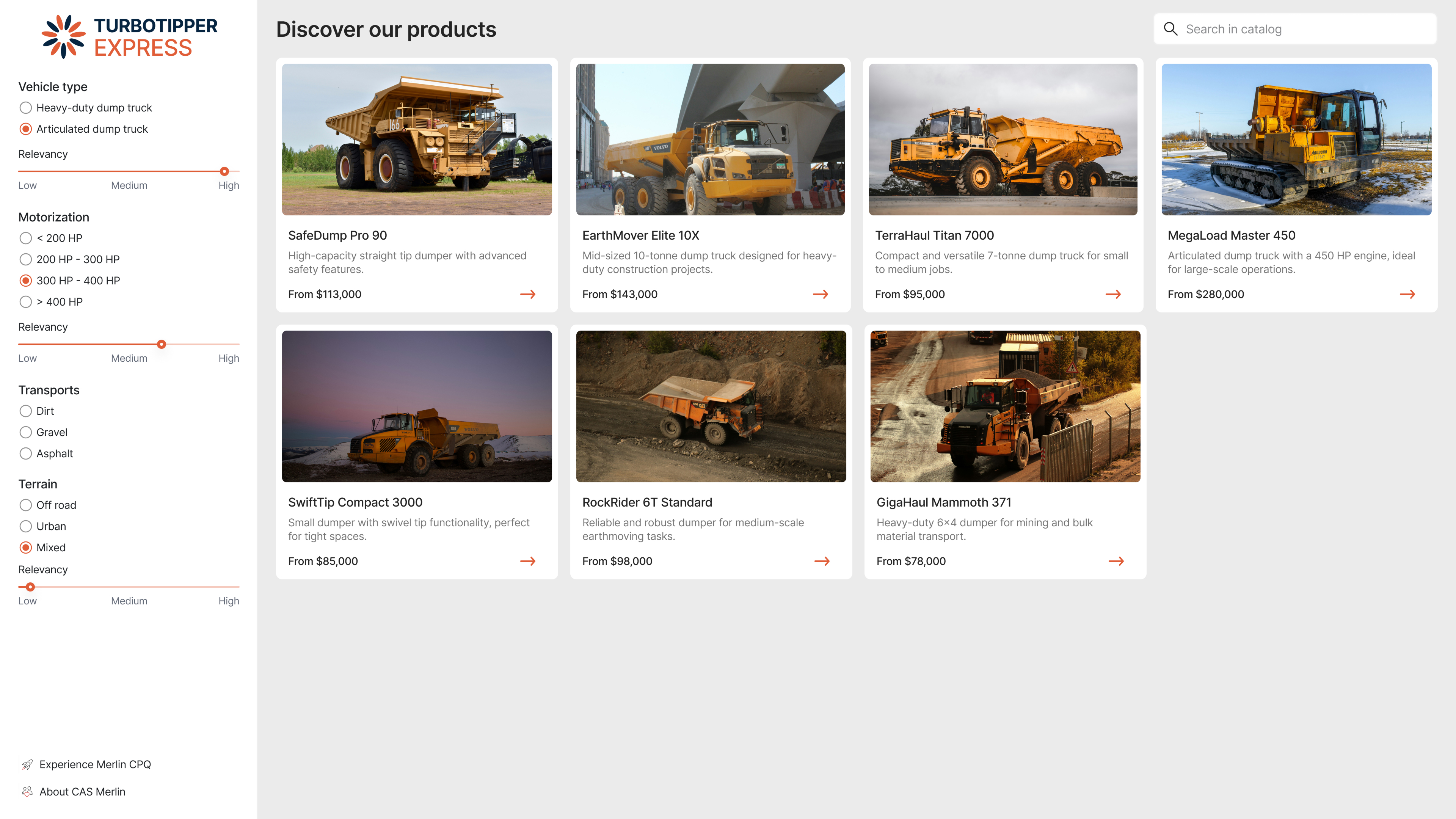
However, we consistently received feedback from partners and end-users about a critical pain point: discovering the right product was needlessly difficult. Users searching within the configurator were overwhelmed by lengthy lists of options, often presenting more than 10 suggestions at once. This led to choice overload, decision paralysis, and frequent search abandonment.
To understand the root of the frustration, we gathered qualitative feedback from users and partners, focusing on the product discovery phase.
Users felt mentally drained by the sheer number of options presented during search.
Basic filters and categories did not sufficiently narrow down results to relevant matches.
Scrolling through long lists was time-consuming and discouraging, especially for repeat users.
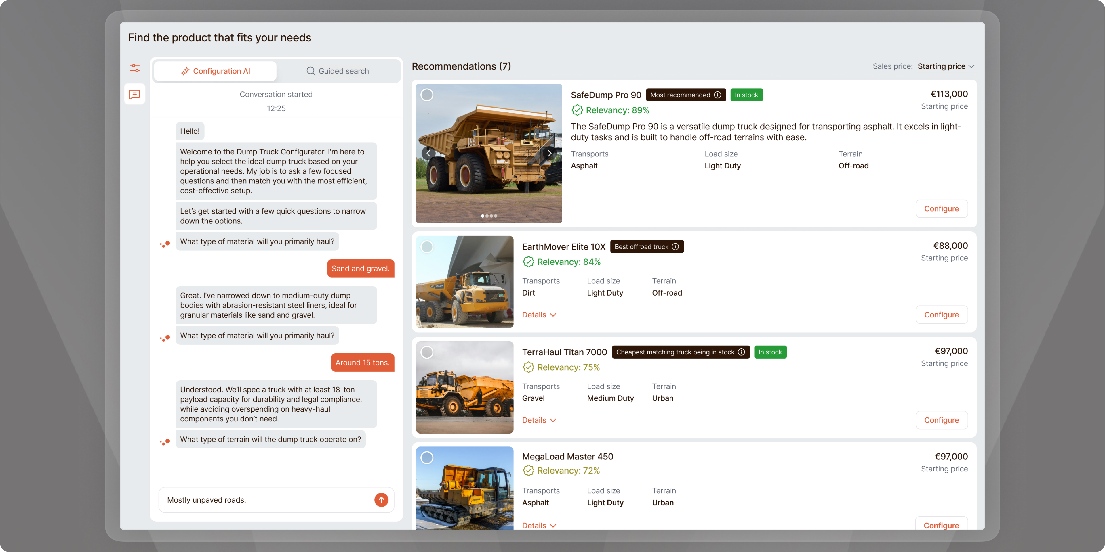
#1 - Modal opens and user could decide if they want to fill in a text about their preferred configuration or skip to a poll-like wizard.
#2 - First iteration of the chatbot - for those who are a bit more confident about what they want.
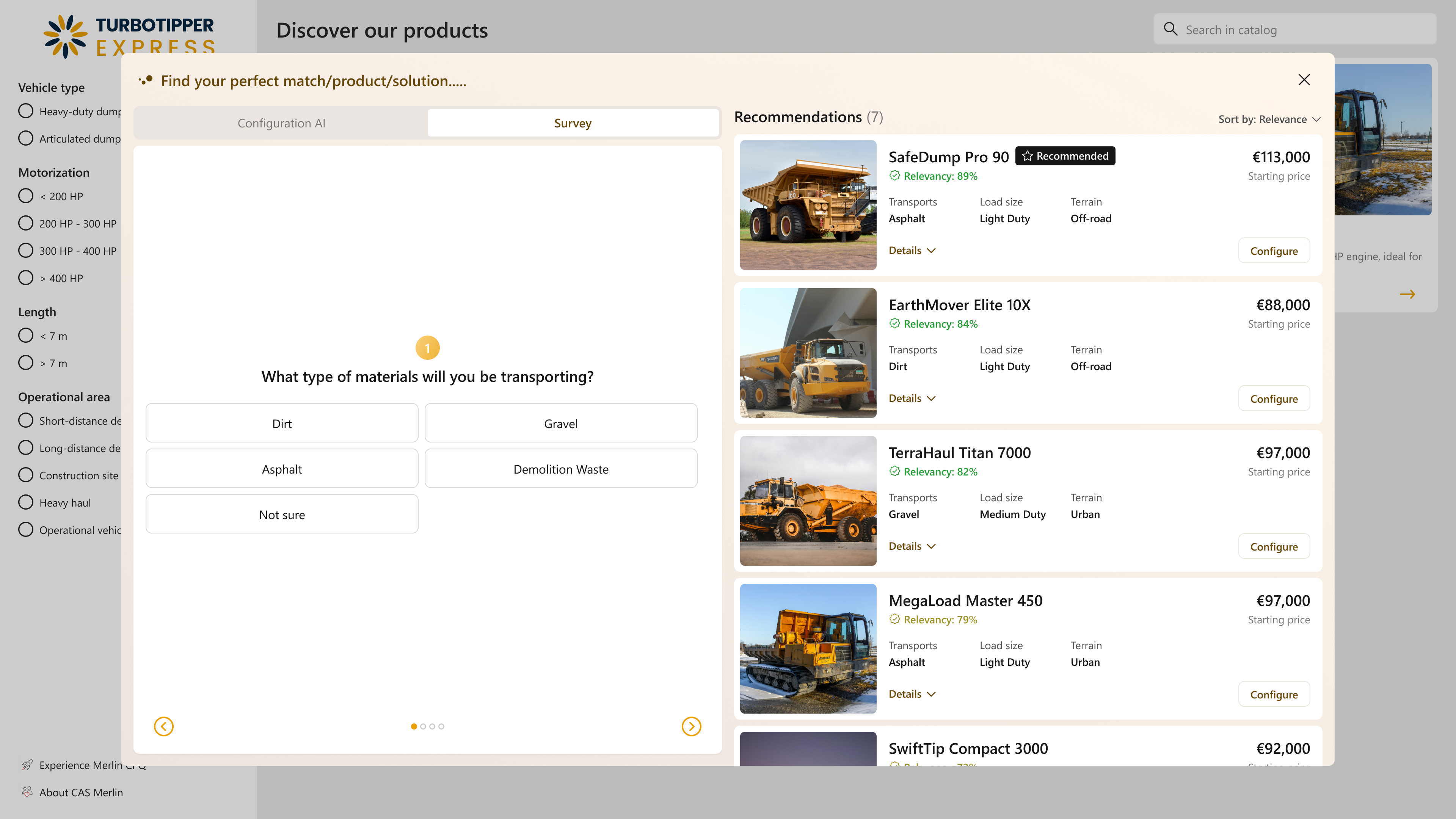
#3 - First iteration of a survey-like configuration helper. For those who are less confident about their preferences.
#2 iteration
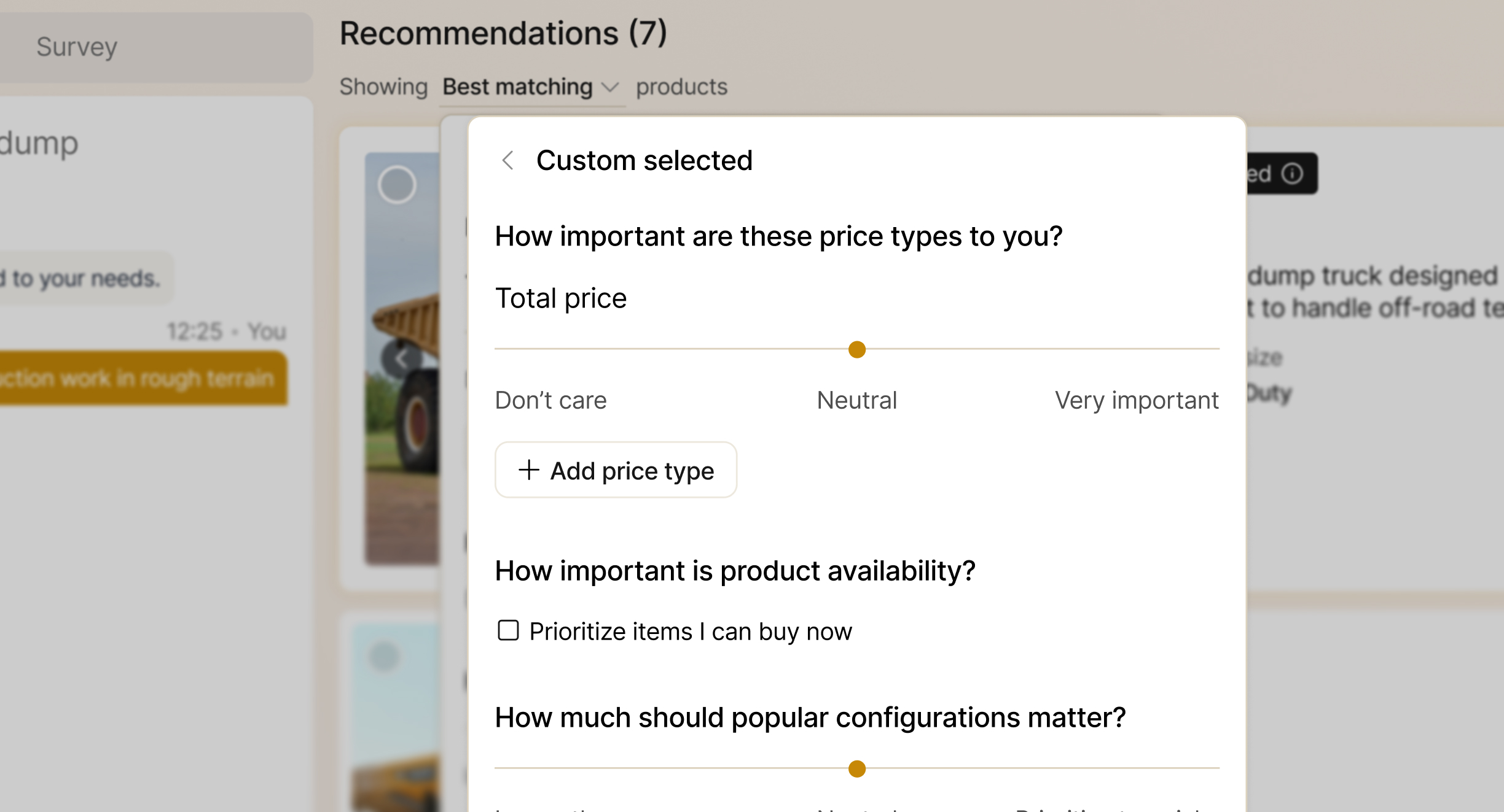
“I want to ignore price sometimes”
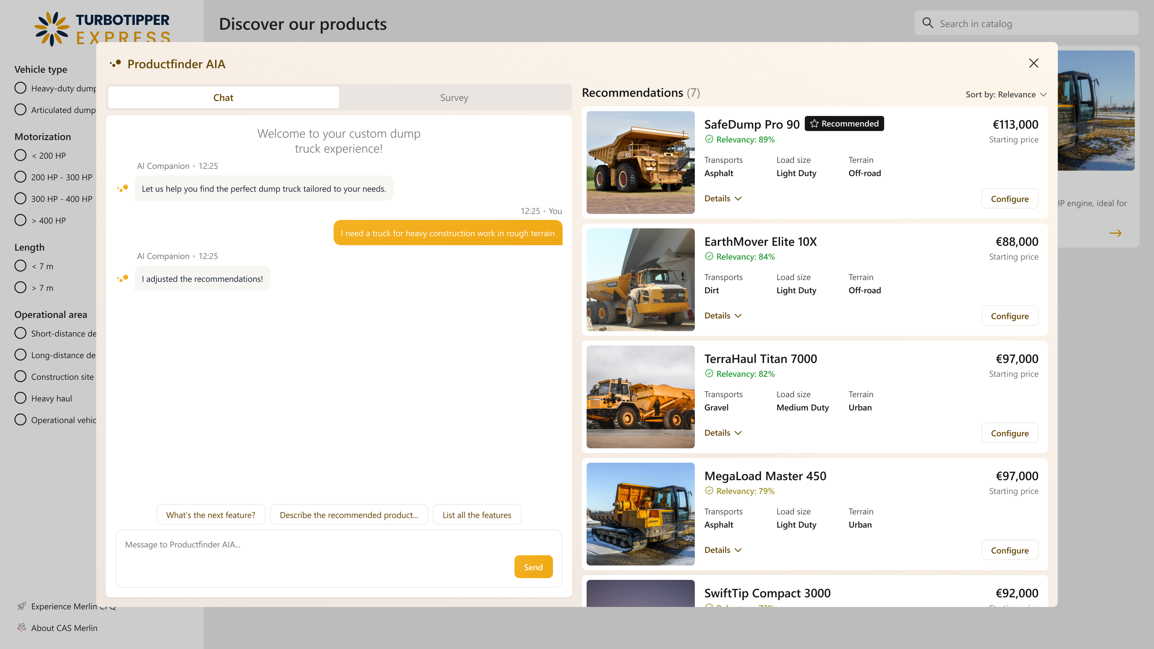
Added price-type importance slider (don’t care → very important)
“Only show products in stock”
Added a filter which includes changing the product listing to show only In-Stock items.
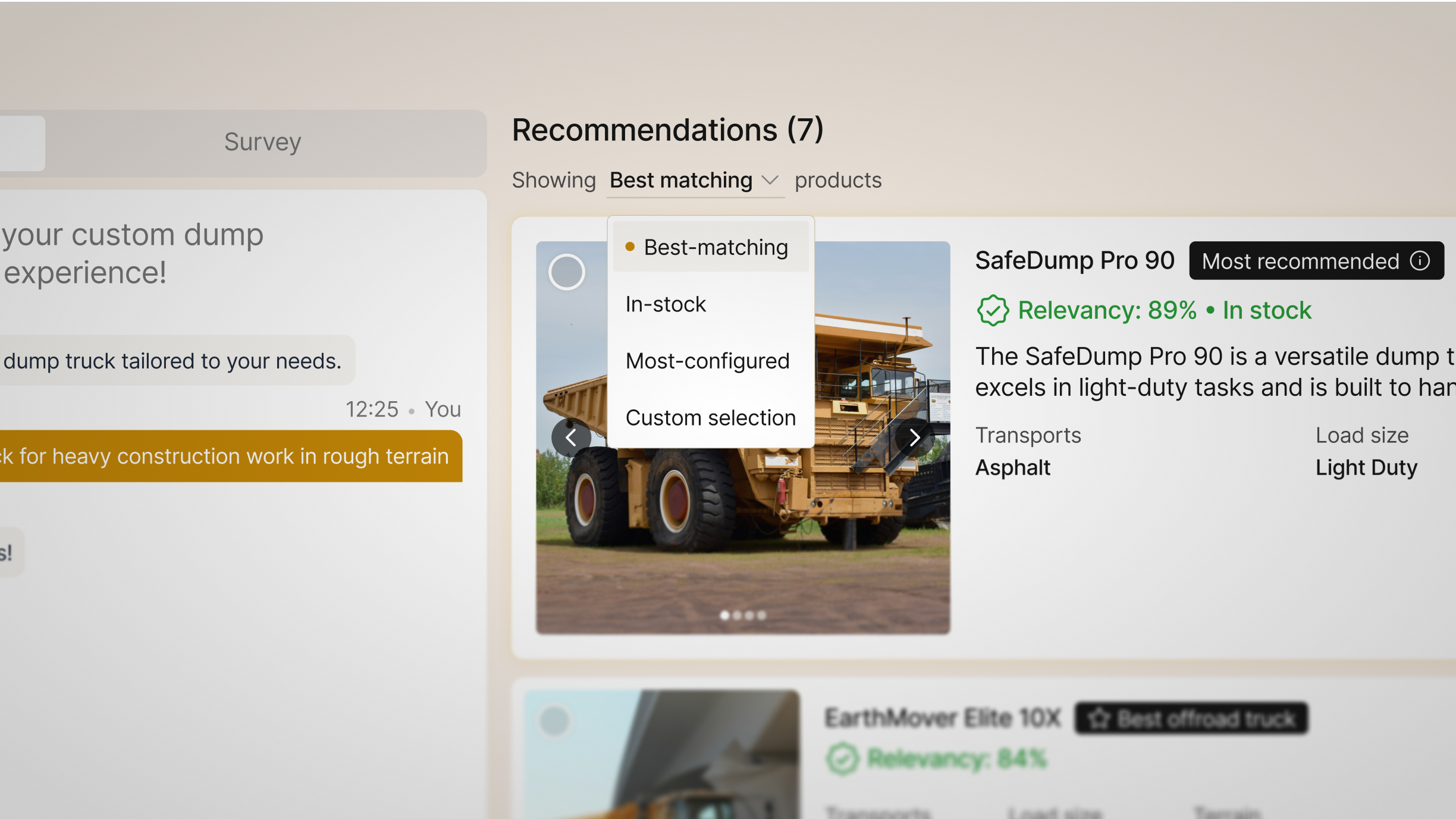
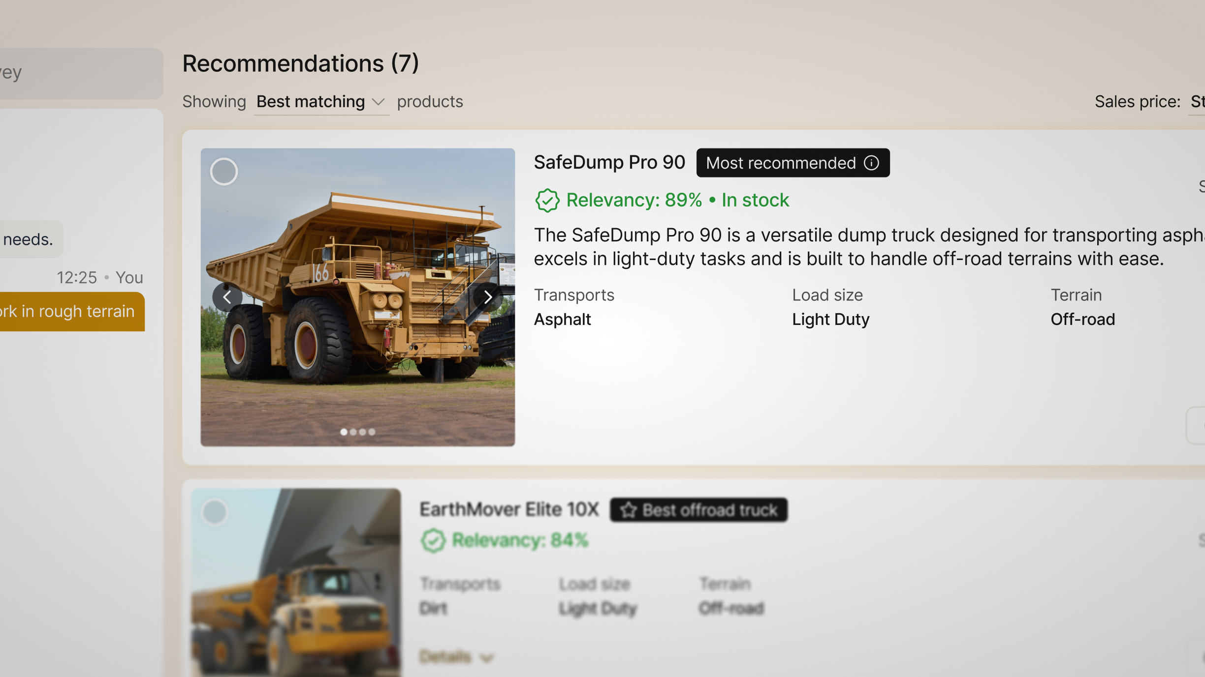
“Top product should stand out”
Increased size of the first result.
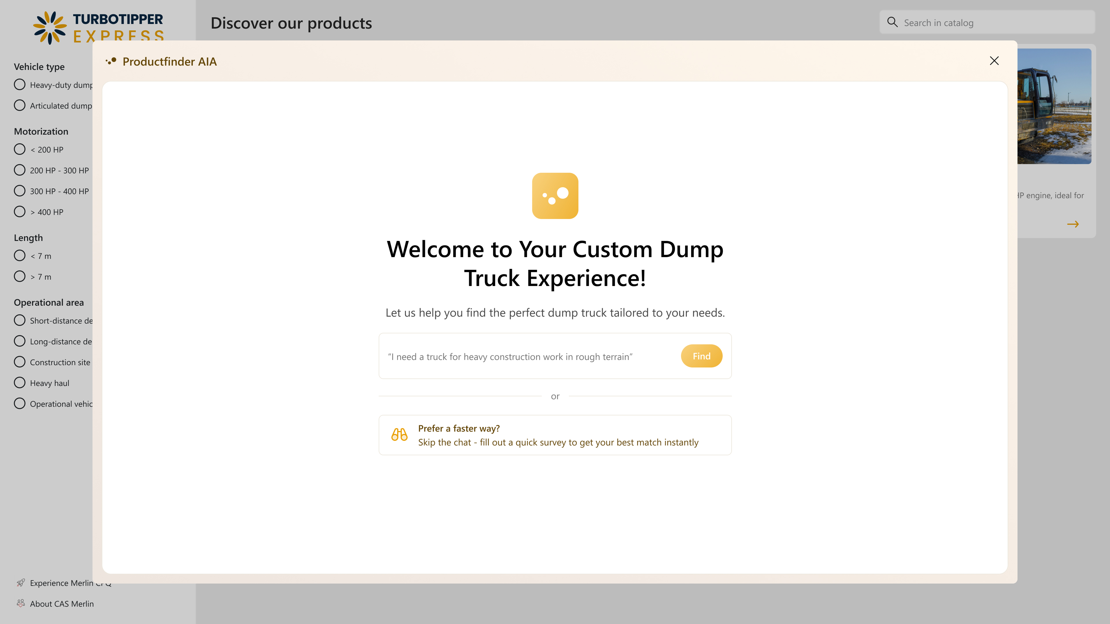
#3 iteration
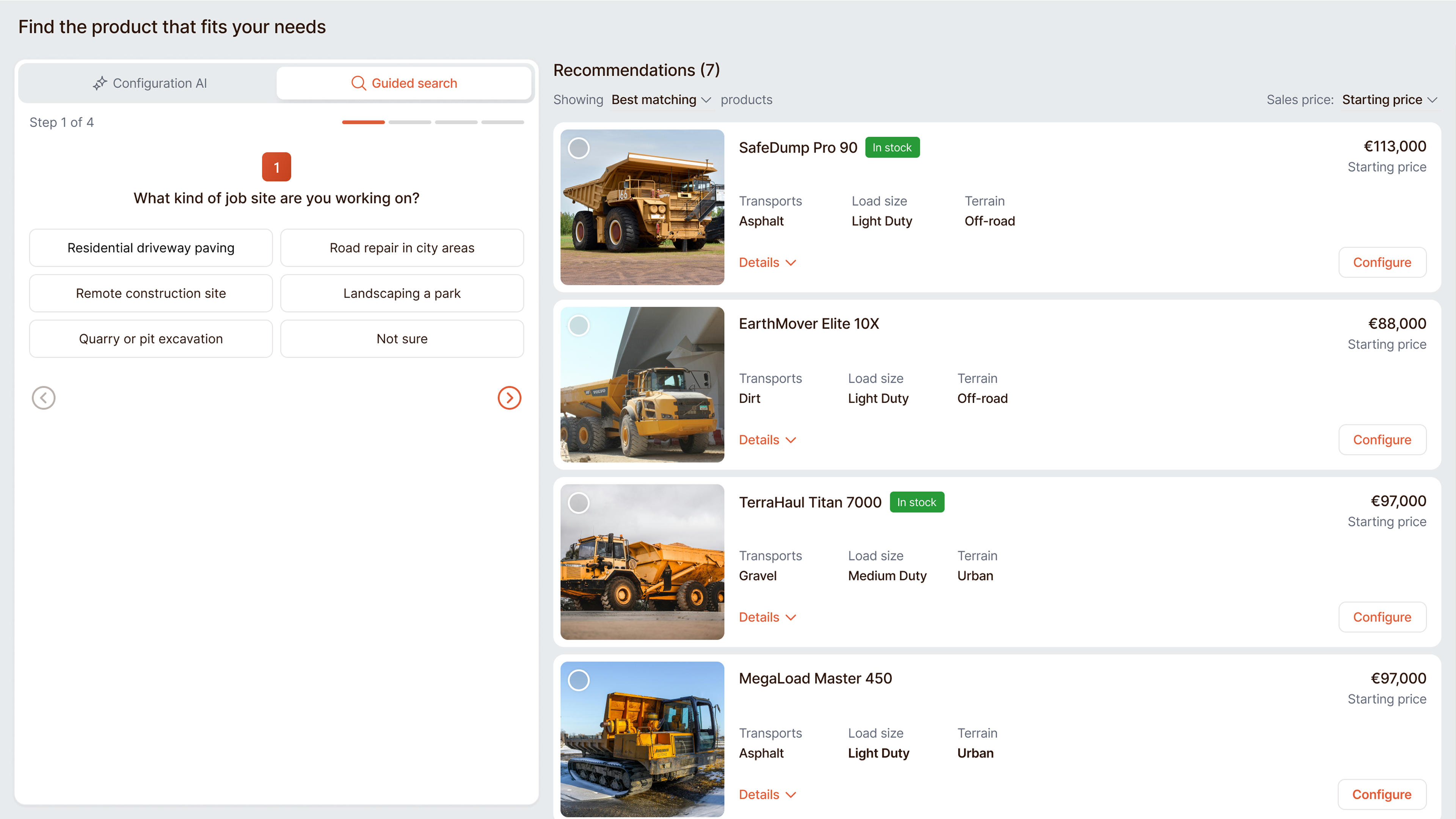
Improved guided search and colors for better visual experience
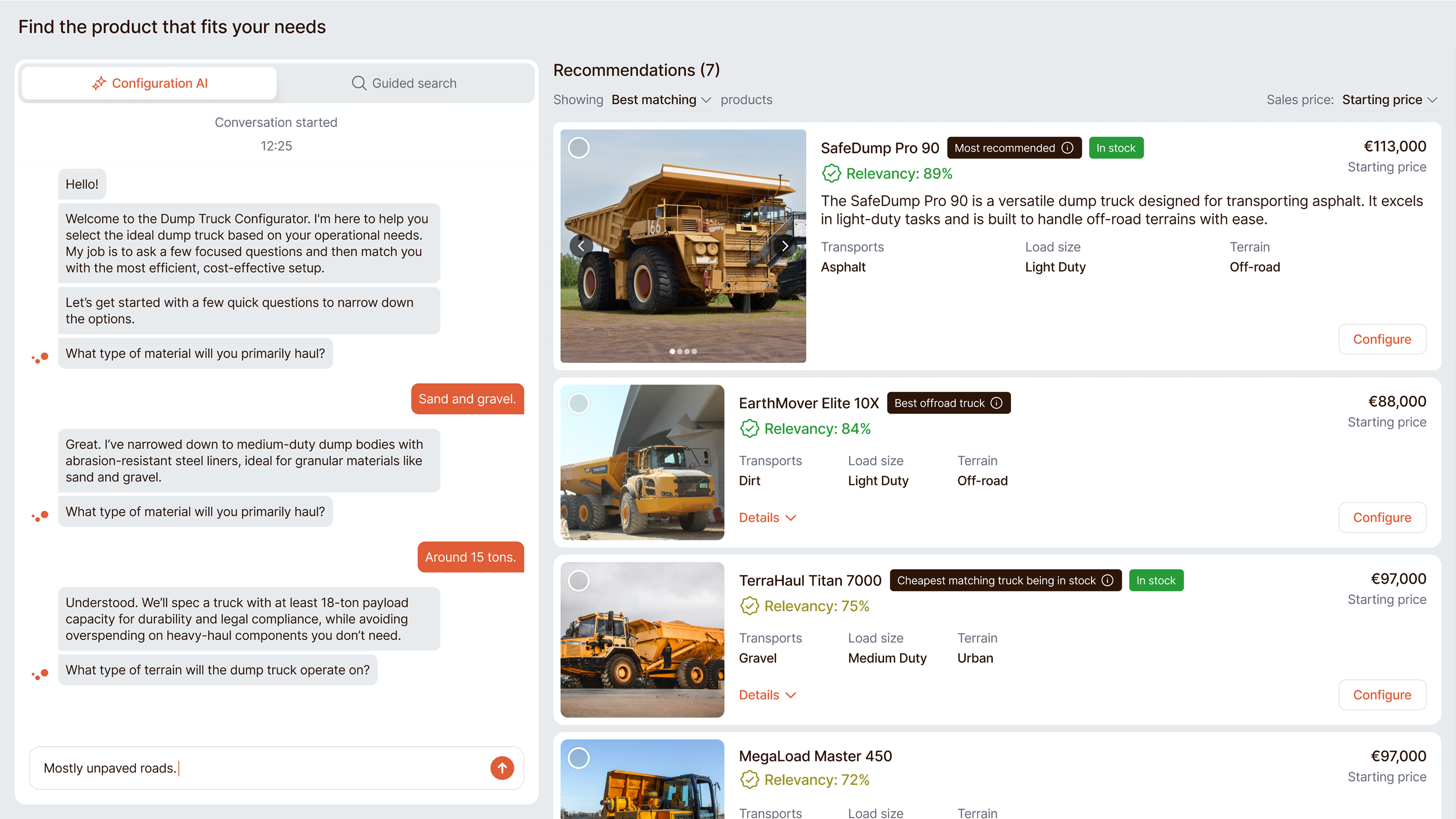
Improved visuals for the chat interface and toggle (chat / survey) refresh
Through this project I learned that asking the right questions from the first round can lead to the best outcome.
Zsolt Nagy
UX/UI Designer located in Hungary